Neptune
|
Law
Making Lawyer Recommendations more informative
A personal journey from user to contributor led to reimagining Neptune's lawyer recommendation interface. By prioritizing user feedback and focusing on information architecture, we created a more transparent and efficient experience for couples seeking prenup services.
Services
Product Strategy
Feature Design
01
The Who
Neptune, formerly known as Bedelia, serves as an AI prenup concierge service that bridges the gap between couples and legal professionals. Their platform combines AI-driven guidance with vetted lawyer recommendations, making the prenup process more accessible and less daunting for engaged couples.
02
The What
While Neptune successfully connected users with legal professionals, their lawyer recommendation interface faced some usability challenges. Users struggled to quickly access crucial information like pricing and availability, and needed more context about why specific lawyers were being recommended to them. As the platform grew, Neptune recognized the need to strengthen trust signals through third-party reviews and create a more transparent recommendation process.
03
The Why
The project began organically when I transitioned from being a Neptune user to a contributor. This unique perspective, combined with extensive user feedback collected by founder Sol, highlighted clear opportunities to enhance the recommendation experience. Users consistently reported difficulties in comparing lawyers efficiently, understanding recommendation rationale, and accessing key information like pricing and availability at a glance.
04
The How
We approached the redesign by prioritizing information architecture and visual hierarchy. The solution centered on a redesigned card component that brought the most crucial information forward:
The redesigned interface prominently displays pricing information, addressing the primary user concern. We introduced a "Best Match for you" tag with specific reasoning, helping users understand why each lawyer was recommended for their situation. The card now features aggregated review counts from platforms like Google, Yelp, and Avvo, building trust through third-party validation. Lawyer availability was made immediately visible beneath the call-to-action button, eliminating the need to click through to multiple calendars.
05
The Results
The redesigned recommendation interface transformed the user experience through thoughtful information architecture rather than dramatic visual changes. By surfacing key information and clarifying the recommendation rationale, we created a more transparent and efficient process for users while maintaining the platform's trusted advisor position. This project laid the groundwork for Neptune's continued platform evolution, with plans to further integrate third-party reviews and enhance the booking experience as engineering capacity allows.
Robinhood
|
Finance
Bento Design System: Reducing Tech Debt with Standardization


Robinhood
|
Finance
Bento Design System: Reducing Tech Debt with Standardization
Robinhood
|
Finance
Bento Design System: Reducing Tech Debt with Standardization
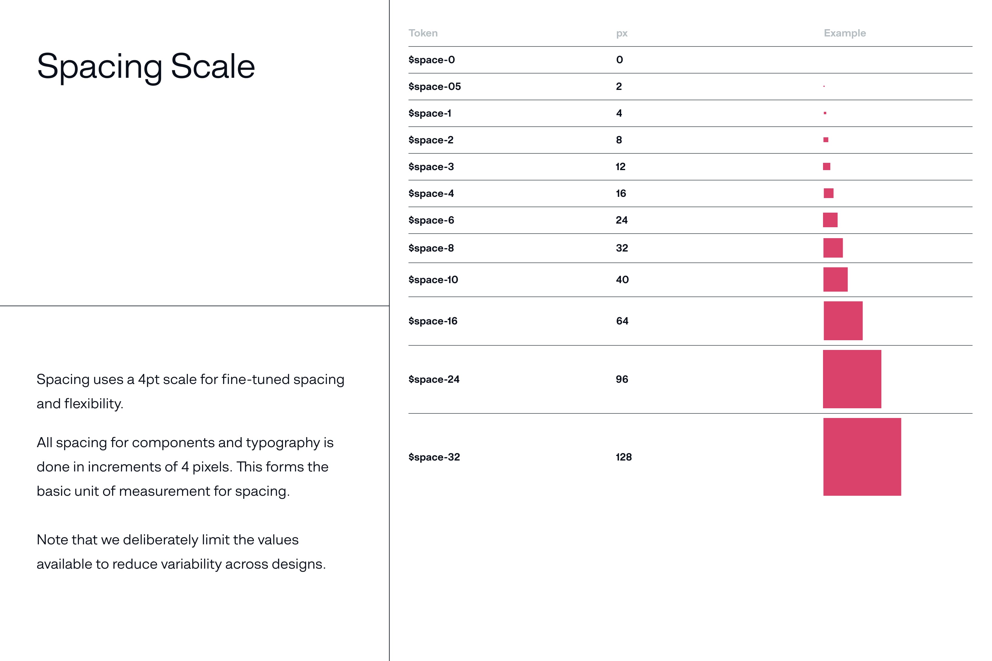
BNY Mellon
|
Finance
DANDA: b2b 0 to 1 Design System From The Ground Up


BNY Mellon
|
Finance
DANDA: b2b 0 to 1 Design System From The Ground Up
BNY Mellon
|
Finance
DANDA: b2b 0 to 1 Design System From The Ground Up
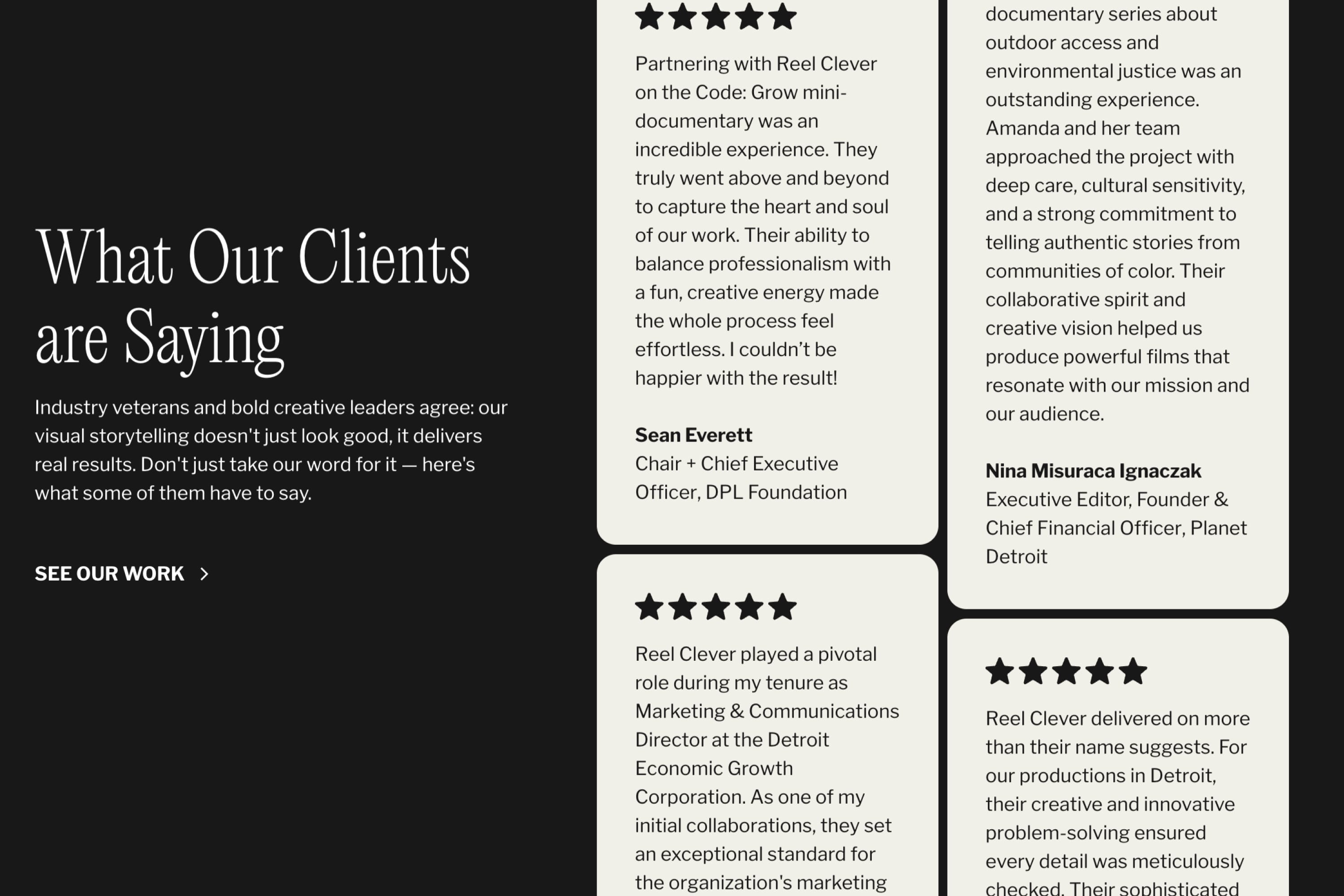
Reel Clever
|
Agency
Reel Clever Site Redesign

Reel Clever
|
Agency
Reel Clever Site Redesign
Reel Clever
|
Agency
Reel Clever Site Redesign
Dave
|
Finance
HoneycombDS: Building relationships and a shared vision


Dave
|
Finance
HoneycombDS: Building relationships and a shared vision
Dave
|
Finance
HoneycombDS: Building relationships and a shared vision
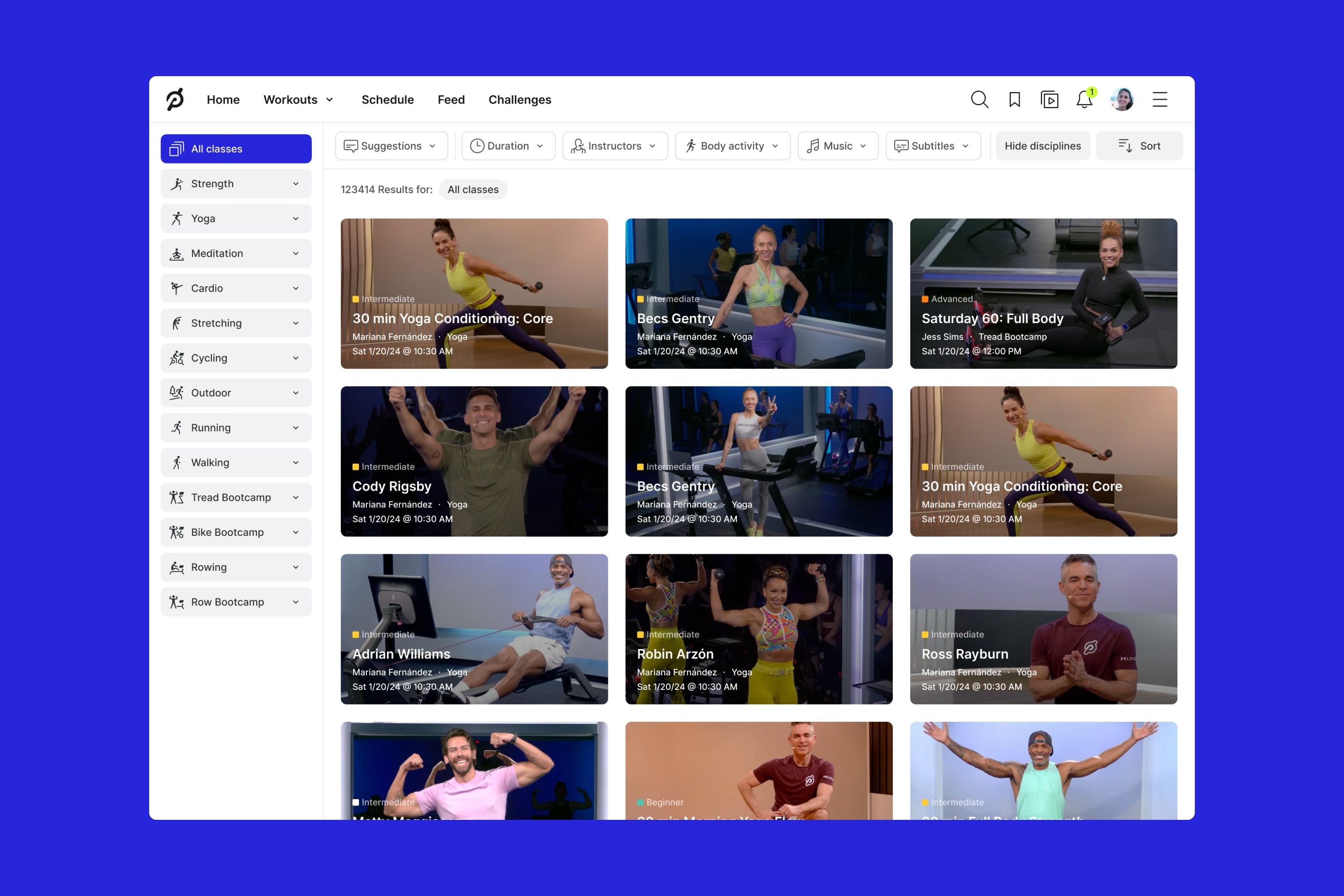
Peloton
|
Fitness
Revamping Class Search

Peloton
|
Fitness
Revamping Class Search
Peloton
|
Fitness
Revamping Class Search
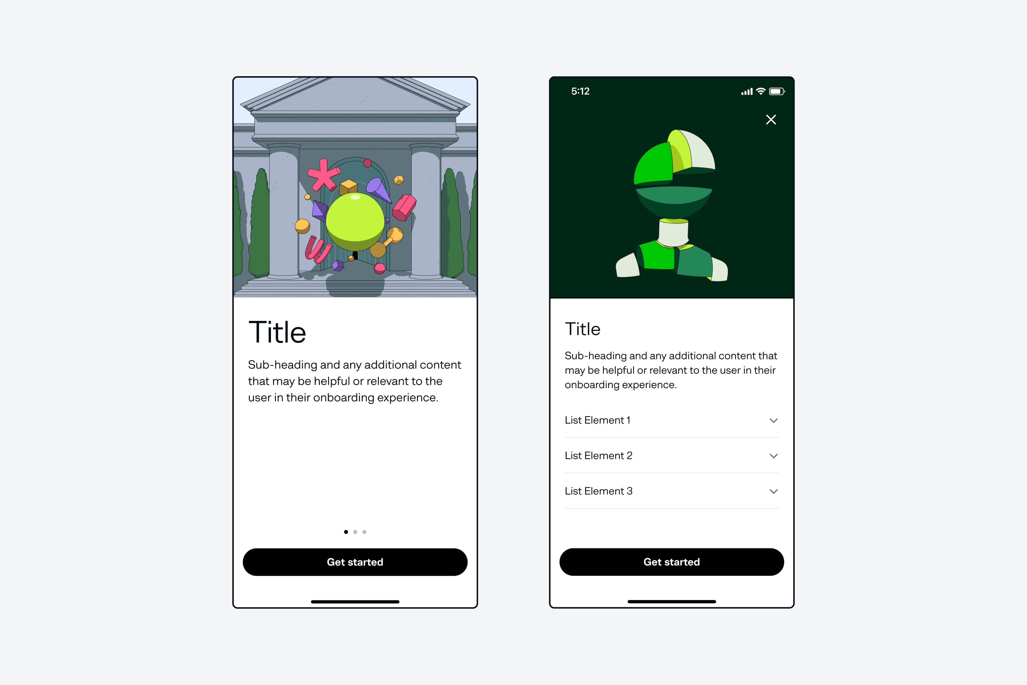
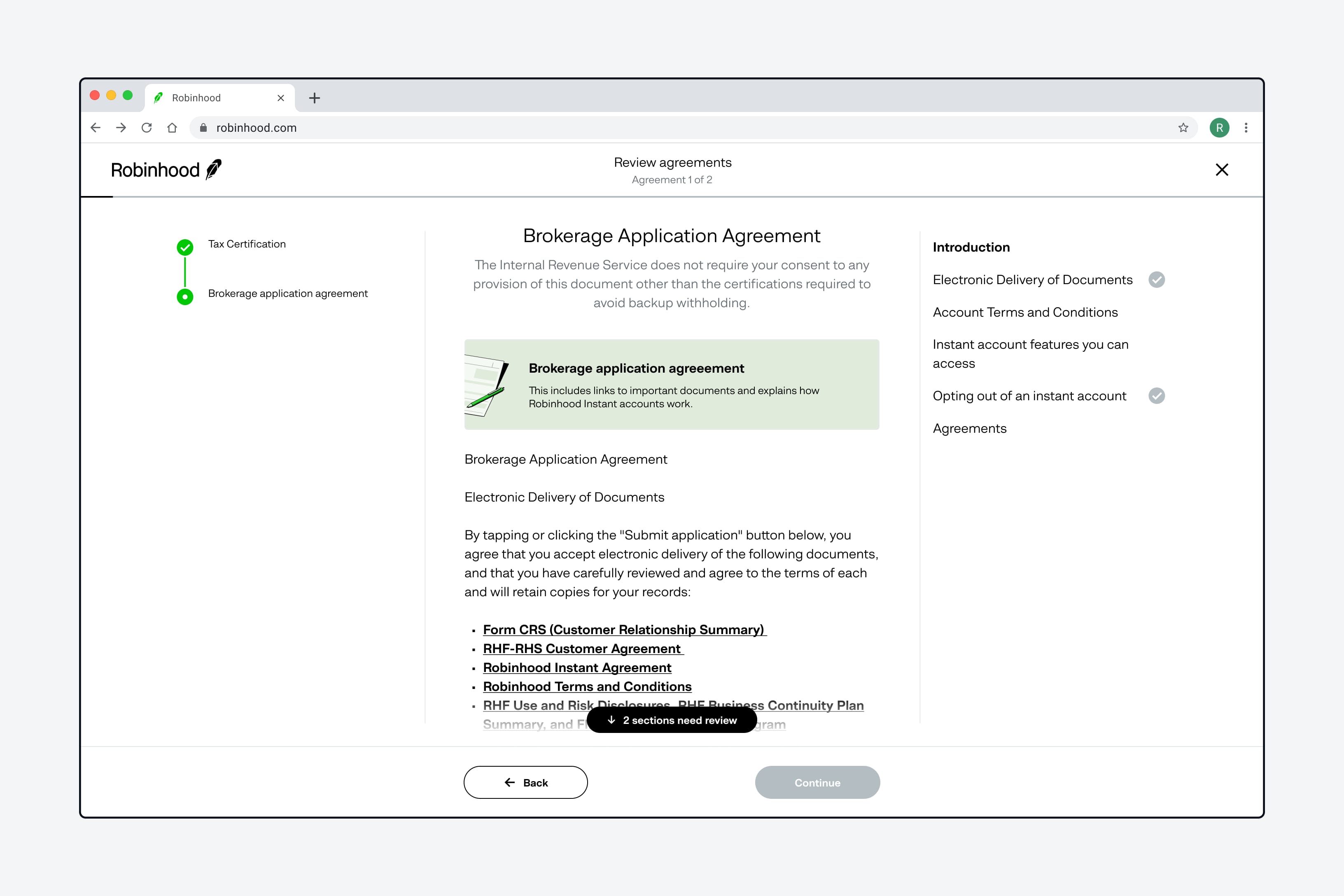
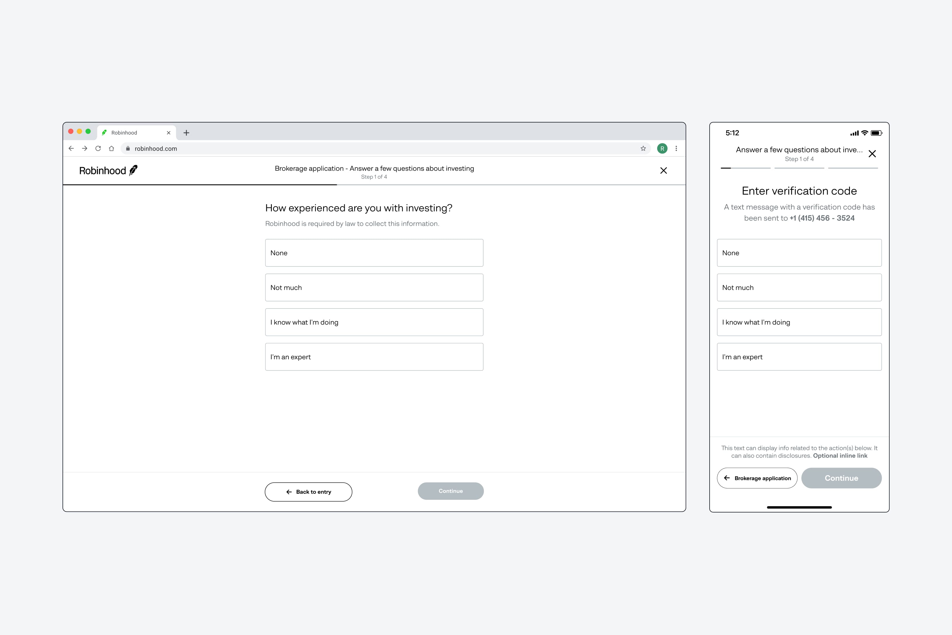
Robinhood
|
Finance
Reimagining Forms at Robinhood
Robinhood
|
Finance
Reimagining Forms at Robinhood
Robinhood
|
Finance
Reimagining Forms at Robinhood
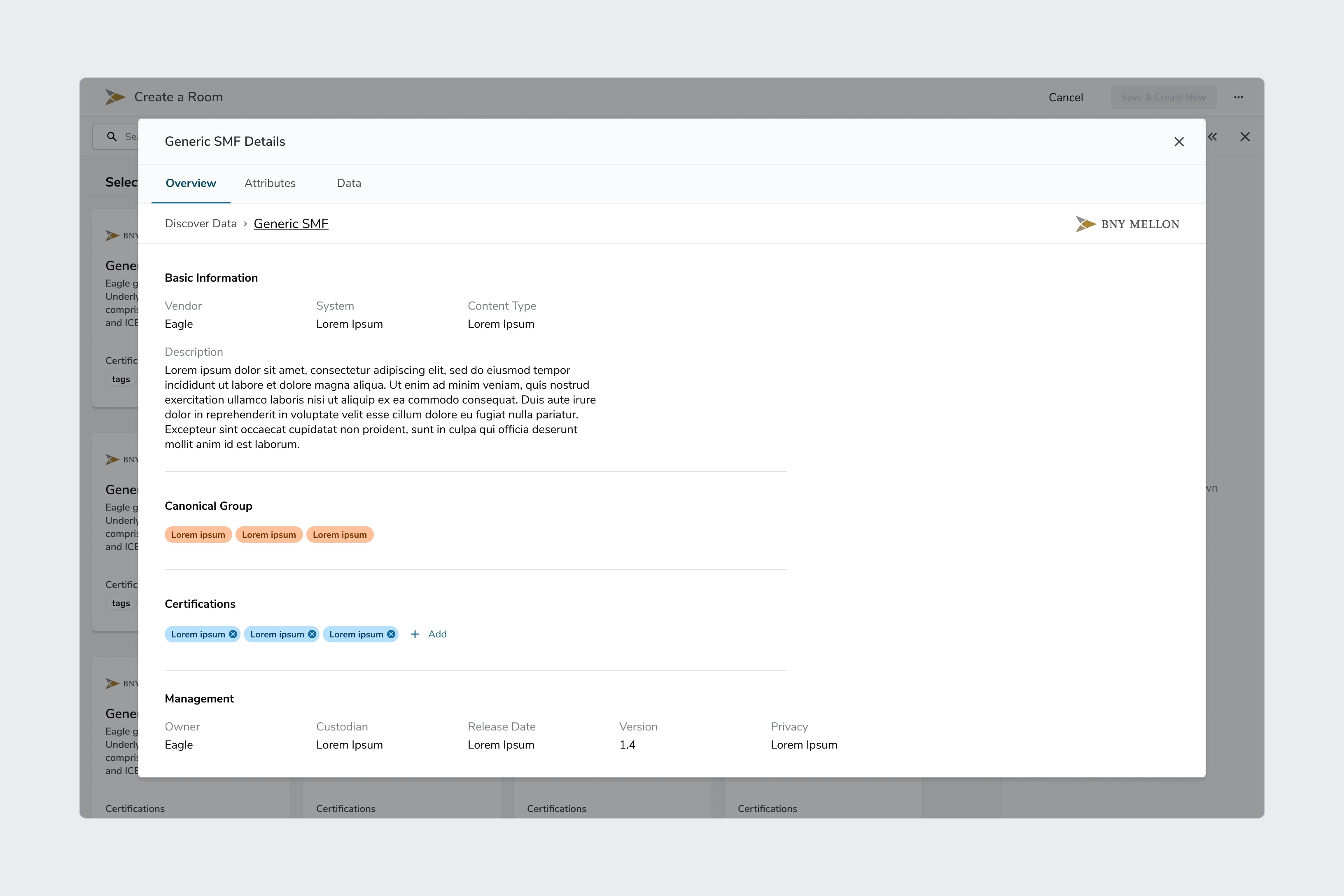
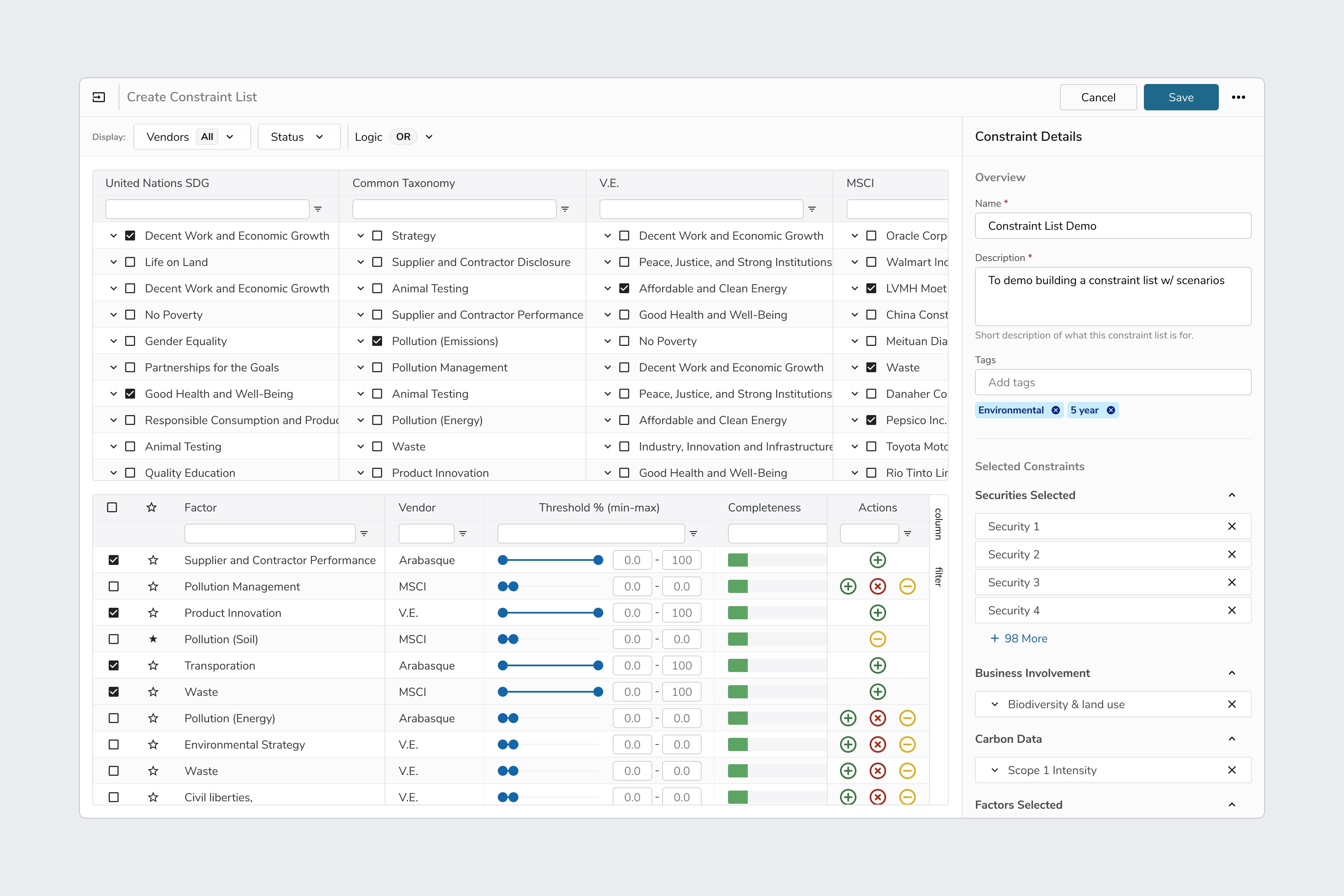
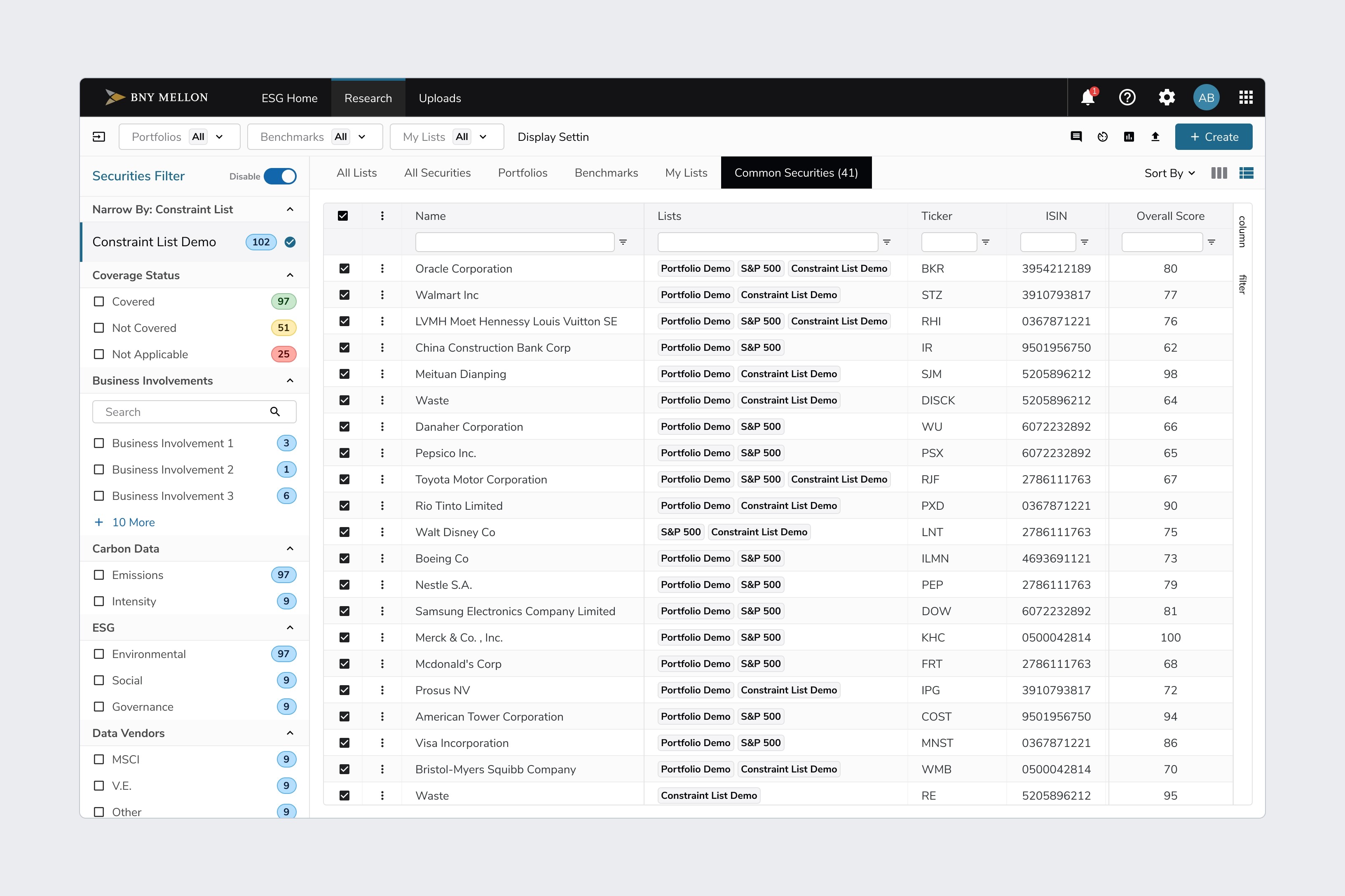
BNY Mellon
|
Finance
BNY Feature Work Overview
BNY Mellon
|
Finance
BNY Feature Work Overview
BNY Mellon
|
Finance
BNY Feature Work Overview
House2Home
|
E-Commerce
Home shopping without breaking the bank


House2Home
|
E-Commerce
Home shopping without breaking the bank
House2Home
|
E-Commerce
Home shopping without breaking the bank
Load More